
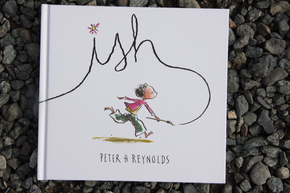

we had a little watercolor & ink action today, inspired by the lovely illustrations of one of our favorite author/illustrators, peter reynolds. we used his wonderful book, "ish", to lead us (given to us by my amazing kid-book-finder sister, jessica). i just love all the inconsistency and texture of water color, and the works of these little artists are wonderful examples of its potential.

 we used permanent markers to draw lines first,
 adding watercolor next.
for older artists, used to having more control with markers, pencils, etc., a "looser" medium like this can be frustrating (it has been for leif coming back to watercolor as he gets older and more detail-oriented in his work). he was relieved by his ability to use the ink for his detail work. we went over reynolds' illustrations together, observing the blotchiness and inconsistent color of his work, and that helped, too.
 we also had salt to play with, to add some texture, and for eric, this was the most fun. the surface of his finished piece is a cystalized masterpiece. leif has yet to use salt on his, but wanted to use it on his cactus to make it seem "pokey" (will post a pic soon).
 as the kids worked and experimented, it became evident how much fun they were having throwing and splashing paint...i think a jackson pollock inspired work is in our future....

No comments:
Post a Comment